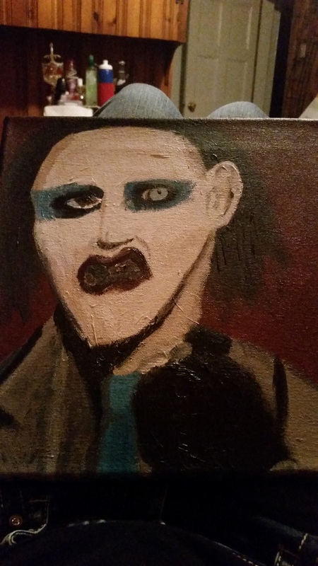
 Marilyn Manson was my subject for schoolastic 144. I went with the theme creepy, seeing as Marilyn Manson isn't the most ordinary person. I decided to go with a blood red background to match Manson's lipstick and emphasize the creep factor. However, a lot of work needs done to make this a finished piece. His mouth is probably the most distracting part about the piece. It was very difficult to paint, because there were no definite lines in my reference picture. The colors in his jacket are very off. Different tones, and shading need to be added to make him more 3-D. However, I do like the overall similarity to Manson himself.
0 Comments
My first and foremost favorite artist, both musically and visually would be Marilyn Manson. He is the front man of his own band which started out in Fort Lauderdale, Florida in 1989. However he's always been a painter. I wanted to share his work, because it represented myself in a way. With the thick black outlines representing a harder exterior, but the colorful inside showing the truly great person i aspire to be. Manson is most known for his use of watercolors, however every now and then some abstinence seems to get mixed in with the work, creating a very vivid visual. 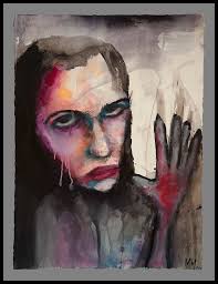 My second favorite artist wold have to be Megan Massacre. She's an amazing tattoo artist most famously known from her work on N.Y. Ink's shop in New York. I absolutely love her bold and bright artwork. She mainly focuses on color, something I admire since color isn't my strong point. I also love how she inks typical girly fantasy tattoos. Her creepy dolls are a favorite of mine. She mostly works with ink and a needle, but occasionally switches out for acrylics. 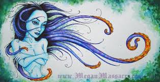 |
